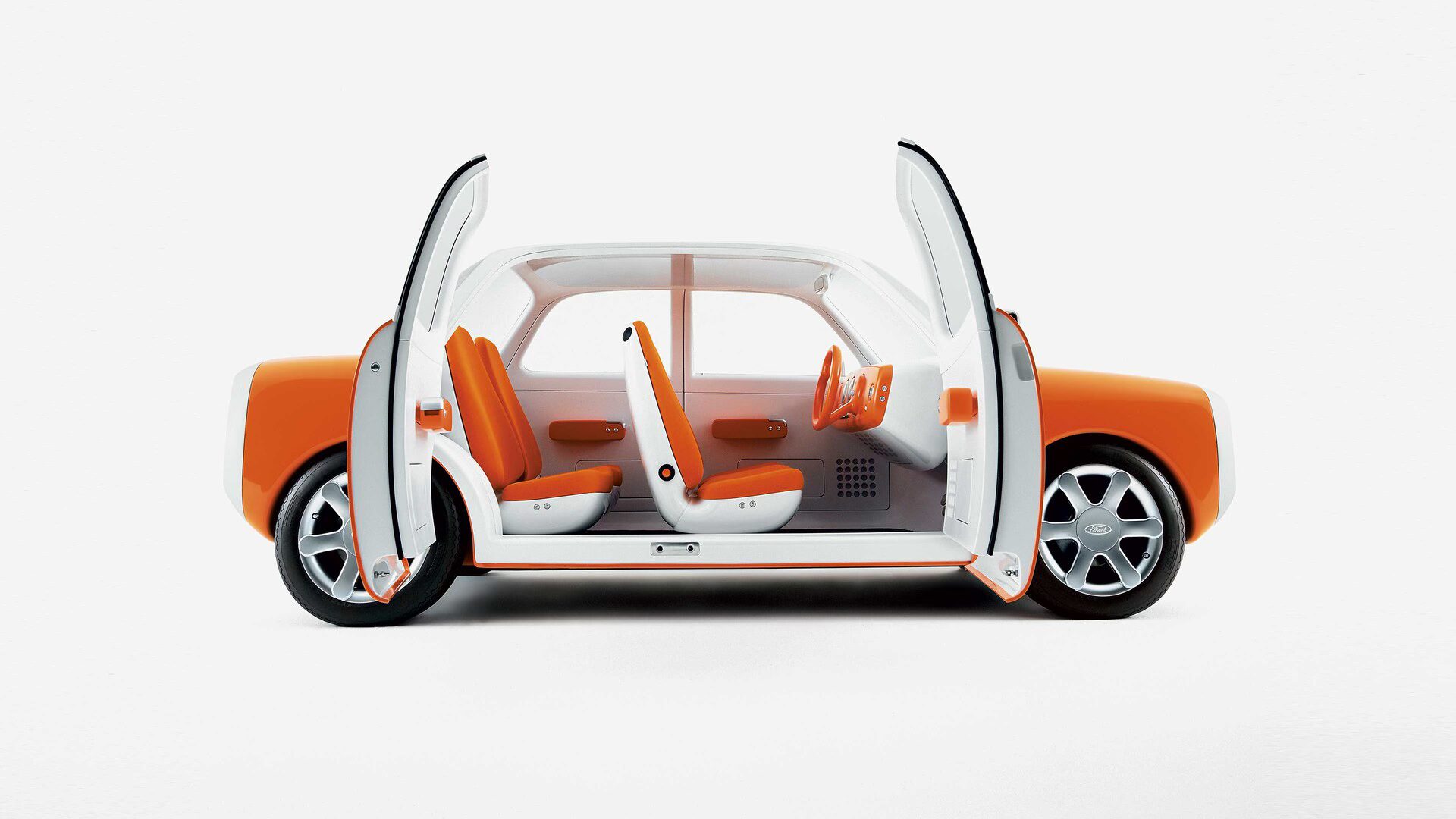
In West Hollywood, empty Waymos move through traffic all day. They stop at the light, indicate, wait for pedestrians and pull away. The behavior is new enough to attract attention. The object is almost aggressively familiar.
It has four doors, forward-facing seats, a steering wheel and the silhouette of a car designed to be driven. When a passenger gets in, the driver’s seat remains empty but symbolically in charge. The entire cabin points toward the person who is no longer there.
An autonomous car is a room on four wheels. So why does the room still look like a car?
There are practical answers. Safety standards, crash structures, insurance, manufacturing systems and public acceptance all favor continuity. Waymo’s current service uses vehicles derived from conventional passenger cars. Its newer Ojai vehicle moves toward a passenger-first cabin with a lower step-in height and accessibility improvements, but it remains recognizably automotive. Radical interiors are difficult to regulate and even harder to trust at speed.
The familiar form is doing transitional work. It tells the passenger that, although the intelligence has changed, the contract has not.
Technology often arrives this way. Digital books preserved pages, covers and shelves. AI entered through a blank text box because conversation made an unfamiliar computational system feel socially legible.
Interfaces are filled with objects that survived their own disappearance. The phone app still uses the curved receiver of a landline. Video is usually represented by a strip of photographic film. Saving appears as a floppy disk. To someone born after these objects disappeared, the symbols may resemble a banana, a bunk bed or a vending machine.
The misrecognition does not prevent the interface from working. A person learns that the shape means “call” without knowing what kind of phone it depicts. The symbol has become independent of its source.
This is a strange second life for skeuomorphism. Physical resemblance initially helped people understand unfamiliar digital behavior. Eventually the digital behavior became familiar enough to teach the obsolete symbol. The phone icon no longer represents a phone. It represents the memory of how calling used to look.
Waymo performs the same maneuver at architectural scale. The empty driver’s seat is a physical icon. It tells passengers, regulators and other drivers that this unfamiliar system still belongs to the category of car.
Inherited objects are not failures of imagination. They are how change negotiates permission. The first version needs to be understood before the later version can become strange. A steering wheel reassures the regulator, the manufacturer and the passenger even when none of them expects it to be touched.
But transitional forms have a habit of becoming permanent. Once infrastructure, habits and business models collect around them, the metaphor hardens. The old object begins to dictate what the new capability is allowed to become.
The car makes this especially visible. If nobody has to drive, the interior could prioritize conversation, privacy, sleep, work or entertainment. Seats could face one another. The trip could resemble a small lounge, a cinema, a meeting room or a spa. The point is not that every robotaxi should contain a conversation pit. It is that forward-facing attention is a residue of control, not an eternal passenger need.
The same question should be asked of AI products. Does intelligence naturally belong in a chat window, or is chat the steering wheel we kept because it made the system easier to approach? Does a generative tool need to produce documents and slides, or are those simply the containers organizations already know how to approve?
For teams, inherited form should be treated as a stage rather than a conclusion. Early familiarity can accelerate adoption. Later, it can suppress the behavior that made the product new.
Every emerging category therefore needs two roadmaps: one for what can be built now, and another for what the product becomes once it no longer has to explain itself through the past. The future initially arrives as an icon of the past. The question is when that icon stops helping us understand the new behavior.
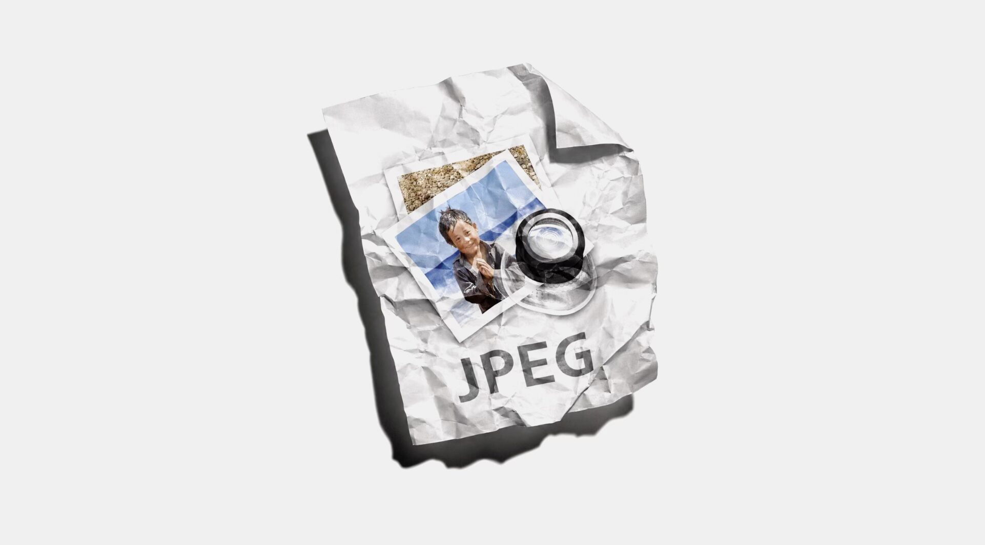
The other day, I remembered that I own an NFT.
I bought it in 2021 and then immediately forgot about it. Like everyone else, I assumed the market had disappeared with the celebrity endorsements, pump-and-dump schemes and fraud that came to define the period.
Instead, I found that NFT sales reached $678.9 million in January 2025. In July, another $574 million changed hands across more than five million transactions.
The numbers were difficult to reconcile with the silence around them. Nobody talks about NFTs anymore, yet hundreds of millions of dollars are still moving through the market.
In 2021, auction houses treated NFTs as the future of collecting. Christie’s sold Beeple’s Everydays for $69.3 million, established a Digital Art department and launched an on-chain auction platform. Sotheby’s created Sotheby’s Metaverse and later opened a secondary marketplace.
Christie’s closed its dedicated Digital Art department in 2025, although it continues to sell digital art through its wider contemporary-art business. Sotheby’s still operates a Digital Art department, but the idea that NFTs required an entirely separate commercial universe has weakened.
In late 2025, MoMA added eight CryptoPunks and eight Chromie Squiggles to its collection through donations from collectors and members of the on-chain-art community.
The works entering MoMA were donated. That distinction matters. They did not pay market prices or bet on their recovery. It accepted the works into its collection, making a curatorial and historical commitment rather than a financial investment.
Museums do not only collect what succeeded. They also preserve experiments that changed how art was made, owned or understood.
MoMA’s selections preserve two of the clearest legacies of the period:
- CryptoPunks: blockchain as identity.
- Chromie Squiggles: blockchain as a creative system.
CryptoPunks were not the first NFTs, but they established much of the structure that later defined the profile-picture collection: 10,000 algorithmically assembled characters with visible rarity, public ownership and a secondary market.
The Punk became an image, avatar, asset and social signal at once. Thousands of later projects copied the structure.
Erick Calderon’s Chromie Squiggle represents a different breakthrough. It is an on-chain generative artwork comprising 10,000 unique outputs. The artist created the rules, code generated each variation and the blockchain recorded its production and ownership.
The crash made the distinctions visible
During the boom, high prices made speculative attention look like historical significance.
Conceptual experiments, algorithmic artworks, celebrity promotions and interchangeable cartoon animals appeared on the same marketplaces. They were judged through the same interface: floor price, sales volume, rarity and number of owners.
Once prices fell, institutions could begin separating art that merely used blockchain as a sales mechanism from art that investigated what blockchain could change.
The museum was not collecting an “NFT aesthetic.” It was preserving different answers to a new question:
What happens to art when ownership, generation, exchange and provenance become programmable?
The people who own these assets are helping place examples inside institutions. This dynamic is not unique to NFTs. Collectors have long donated works to museums, whose recognition can strengthen the cultural standing of an artist and, indirectly, related works they continue to hold.
But blockchain makes the relationship unusually visible.
So, what’s up with NFTs?
The commercial and cultural NFT experiments are separating:
The commercial experiment asked whether blockchain could create an enormous market for digital scarcity. It did, briefly. Auction houses built departments and platforms around it. Much of that infrastructure contracted when speculative demand disappeared.
The cultural experiment asked whether blockchain created genuinely new forms of art, ownership and online behavior.
Museums appear to believe that it did.

Soup of responsibilities
Apparently, I'm in the top one percent of Cursor users in Los Angeles.
I'm not sure what that says about me. Probably that I should get out more. Or maybe it was just a really good email campaign…
I've spent most of my career as a creative director, but I've always been an entrepreneur. Lately, I've become completely obsessed with building software.
I don't particularly like the term vibe coding. It makes the whole thing sound so nonchalant. I care about what I'm making.
And what I love isn't just the coding. It's the whole thing. Finding an opportunity, developing the idea, building the product, figuring out the business, the marketing, the sales. All of it.
For the first time, I can take an idea remarkably far without needing an entire team behind me.
It's an incredibly empowering feeling.
A friend recently invited me to a creative leadership retreat organized by Design Better. It brought together people who have spent most of their careers making things, leading teams, and building creative departments.
One thing kept coming up.
Everyone seems to be doing more with less.
Not necessarily better work. Just more of it.
I found this interesting because I've been experiencing almost the opposite. The same technology that's making some people's working lives more demanding is making mine considerably more exciting.
Organizations are using AI to increase output. Individuals are using it to increase what they're capable of.
And those aren't necessarily the same thing.
I've been trying to look past the hype, the productivity claims, and the endless demonstrations of what AI can do. But I keep coming back to what this might mean for two disciplines I've spent much of my career working between.
The future of product design
I think product and interactive design will feel the consequences before most other creative disciplines.
For years, the time and resources required to build software created a natural limit on how quickly product design could move. Research cycles, roadmaps, months of development. You could spend weeks exploring a problem because building the solution might take months.
That relationship is changing.
Product managers can build features. Developers can design interfaces. Designers can ship working software. Small teams can make things that previously required entire departments.
Of course, building something is not the same as maintaining it. More software creates more work, and removing one bottleneck often reveals another.
But the possibilities are changing.
And here's a prediction I find particularly interesting.
Product design and digital teams might start looking a lot more like brand creative teams.
Smaller teams. Shorter production cycles. Specialists brought in when they're needed. Less time maintaining processes around the work and more time actually making something.
There's some irony in that. Product design spent years distinguishing itself from advertising, only to potentially end up borrowing its working model.
COVID normalized distributed teams. AI is making smaller groups considerably more capable. And the boundaries between disciplines are becoming harder to defend.
For years, we've been inventing increasingly specific titles to describe increasingly specific responsibilities.
Now those responsibilities are beginning to overlap.
I'm not suggesting everyone will suddenly become good at everything. Expertise still matters. But the distance between disciplines is shrinking, and some of the organizational boundaries we've built around them are starting to feel rather arbitrary.
And if making products becomes easier, it raises another question.
What happens when everyone can make one?
The future of brand creative
I think something equally interesting is happening in the opposite direction.
In many organizations, brand creative is still largely concerned with how a business presents itself. The identity, the campaigns, the communication. Important work, but often arriving after many of the fundamental business decisions have already been made.
But when making things becomes easier, we're going to end up with considerably more of it.
More products. More features. More images. More companies making remarkably similar things.
And just because something exists doesn't mean anyone will care.
Suddenly, the difficult part isn't necessarily making the thing. It's giving people a reason to choose it.
That's a creative problem as much as a product problem.
I think we're beginning to see brand creative in a different light.
Not simply as the discipline responsible for how a business presents itself, but as something that can help shape the business itself.
The idea, the product, the positioning, and the decisions that determine whether something has a reason to exist in the first place.
And with that comes a greater need to understand strategy, marketing, and distribution.
Not just what something looks like or what it says, but who it's for, why anyone should care, how it reaches them, and what makes them come back.
In much the same way that product designers are becoming more capable of building what they design, brand creatives have an opportunity to become more involved in the businesses they're helping to build.
There's just one problem.
In many organizations, the people responsible for creating the work aren't the people deciding how it reaches an audience.
Creative, brand, media, performance, and distribution can operate as separate functions, each with their own priorities and budgets.
So the people making something worth caring about can be surprisingly far removed from the people responsible for getting anyone to care.
That's a strange arrangement when those two things are becoming increasingly dependent on each other.
You can make something wonderful that nobody sees. You can spend a fortune getting people to see something nobody wants.
Neither seems particularly sustainable.
I suspect the organizations that figure out how to bring these responsibilities closer together will have a considerable advantage.
And perhaps that's where both disciplines are heading.
Product designers are becoming more capable of building what they design. Brand creatives are becoming more involved in the products and businesses they're helping to shape.
The responsibilities are beginning to overlap.
The roles are turning into a soup.
Which makes me wonder what happens to all the titles, departments, and carefully defined responsibilities we've spent decades creating.
When a designer can build, a developer can design, and a creative director can take an idea all the way to market, where does one job end and another begin?
And does it really matter?
There will always be people who are better at certain things. The builders, the mathematicians, the storytellers, the people who understand how to get something into the world.
But perhaps the interesting part isn't how we divide those responsibilities. It's what happens when we start bringing them back together.
For a long time, the question was whether you had the resources to make something.
Increasingly, the question might be whether you have something worth making, and whether you can convince anyone else that it's worth their time.
I don't know what that means for the future of creative departments, or what we'll end up calling ourselves.
So what would I build instead?
I think I'd start with the idea, rather than the department.
I'd want an organization where the people developing an idea are also involved in figuring out how to make it real. Where designers understand the business, strategists care about execution, and technologists contribute creatively from the beginning.
I'd probably get rid of most titles, too.
Not because experience or expertise doesn't matter. But because titles have a funny way of telling people what they're allowed to contribute to.
I'd build smaller teams with broader ownership. Fewer handoffs. Fewer layers between the people making decisions and the people making the work.
I'd want specialists who can go deep, generalists who can connect things, and leaders who know when to get out of the way.
People would still have responsibilities. Someone would still need to make the final call. But I'd rather define those things around the work than around a hierarchy.
And I'd use technology to give people more time to think, experiment, and make things. Not simply to ask them to produce twice as much.
Most importantly, I'd want people to feel responsible for the whole thing. Not just their little piece of it.
The opportunity isn't to replace teams with individuals. It's to give individuals more capability, and teams more ambition.
I can take an idea a long way on my own now. That's been a thrill. What I'm actually excited about is what people can make once that capability is in the room with other people.
I don't think the future belongs to organizations where everyone does more jobs.
I think it belongs to organizations where more people get to contribute to the idea, and then build it together.
What I do know is that I'm having more fun making things than I've had in years.
I have a feeling the next few years are going to be a complete mess.
And I can't remember the last time I was this excited about it.

There is no blueprint for the in-house agency
The first generation of in-housing was relatively easy to explain. Companies wanted more control, greater speed, closer access to the business and, often, lower costs. Work that had traditionally been handed to agencies began moving inside.
The logic made sense. If the work was constant, why keep renting the capability? Build a team closer to the people making the decisions. Give them direct access to the business, the product and the people shaping both.
So companies built internal agencies. And because agencies were the model everyone knew, many of those teams were structured like agencies too. Creative directors, designers, writers, producers and strategists. Similar departments. Similar processes. Similar ways of working.
When there is no established model, experience has a way of becoming the model.
At first, that worked. The physical distance disappeared. The organizational distance could remain.
But proximity began producing something that was harder to anticipate: knowledge.
Not knowledge in the abstract. The accumulated understanding that comes from being there every day. Why a decision was made six months ago. Which constraint is real and which is inherited. What the product team is worried about. What customers keep misunderstanding. Where the business is going before it becomes a brief.
Over time, that knowledge changes what an internal creative capability can be useful for.
A designer who begins by making campaigns eventually understands the product well enough to influence how it is presented. A writer who starts with advertising develops a feel for the language of the company itself. A creative team that was built to respond to briefs begins seeing problems before anyone has written one.
This is where the agency analogy starts to break down.
An external agency is designed around a relationship between two organizations. There is a client and there is an agency. A brief crosses the distance between them. The agency responds.
Inside a company, that distance is artificial.
The people making the work may sit next to the people making the product. They may be in the same meetings, see the same research and hear the same arguments. They accumulate context simply by being there.
Yet many internal teams continue to operate as though that distance still exists. The business creates the brief. The creative organization receives it. One side decides what the problem is. The other is asked to solve it.
The physical distance disappeared. The organizational distance returned.
That can work. Sometimes it is exactly what the business needs. But it is not the only model.
The interesting thing about mature in-house organizations is that they rarely evolve in exactly the same direction.
In a product company, creative capability might move closer to product development. In an entertainment company, it might become part of how stories are packaged and introduced to the world. In a design-led company, it may influence the product itself. In a large global business, its greatest value might be creating coherence across thousands of expressions.
There is no universal destination because there is no universal business.
Organizations reveal the value of a capability through use.
That is difficult to design on an org chart in advance. You can decide what work to bring inside. You can hire people and define roles. You can establish processes and reporting lines. What is harder to predict is where those people will become useful once they understand the business.
A team built for one purpose begins solving another kind of problem. Someone hired for a narrow discipline develops knowledge that makes them valuable somewhere else. A capability that originally sat downstream starts being invited upstream because the people inside it have accumulated enough context to contribute earlier.
This does not mean every internal agency should become a strategic organization. It does not mean creative should sit at the center of every company. And it does not mean the agency model was a mistake.
The agency model was useful because it gave companies somewhere to begin.
But a starting model should not become a permanent definition.
The first generation of in-housing was about deciding what to bring inside. What happened next was harder to plan. Knowledge accumulated, people became useful in unexpected places, and the business began revealing what the capability was actually worth.
The challenge now is less about building an in-house agency and more about noticing what it has become.
Before deciding how to structure an in-house creative organization, I'd want to understand where its expertise actually lives.
Not just what departments are called or who reports to whom, but what people are genuinely good at. I'd look at past projects, follow how ideas move through the organization, and talk to the people doing the work. Where does each team contribute something unique? Where are responsibilities overlapping? And where is expertise being brought in too late?
The goal wouldn't be to make everyone interchangeable. Quite the opposite. I'd want to preserve deep expertise while creating more opportunities for people to work across disciplines.
The structure should follow the talent and the work, rather than asking the talent and the work to fit an inherited structure.
Where time becomes art
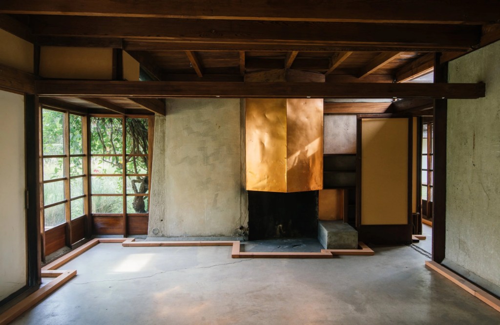
At the Schindler House in my neighborhood, the copper around a fireplace has handprints on it. Most of the metal has darkened, but the places people touched have changed differently.
A fireplace is not an obvious thing to touch. I imagine someone reaching out to feel the copper, then someone else doing the same years later. You cannot tell whose hands they were. You can tell they were there.
I find it more beautiful than polished copper. Nobody arranged the handprints. Someone chose a material that could keep them.
I began thinking about this through Artempo: Where Time Becomes Art, the book accompanying an exhibition conceived by Axel Vervoordt and Mattijs Visser. At the Palazzo Fortuny, objects and artworks from different centuries were brought together to consider what time does to them. Among them were a weathered ancient face and an old vase repaired many times. The exhibition made room for loss and damage, but also for the possibility that time creates.
That last possibility interests me as a designer. Time will act on almost everything we make. Choosing a material means choosing how it might respond.
Before use
A kitchen is photographed before anyone cooks in it. A car is shown before it has been driven. A phone is presented before anyone has held it. We pay extraordinary attention to this first state. It is the easiest moment to control, and the moment when the object must persuade someone to buy it.
Then the object begins doing what it was made for. We know these things will happen, yet we continue to measure their appearance against the image taken before they did.
There are good reasons to protect them. A kitchen must be cleanable, a car must remain safe, and a phone needs a screen we can read. Time can take away far more than it gives. But we already know how to distinguish damage from character in a wooden table or a bronze handle. Why do we so rarely ask what the materials in cars and technology could gain from years of contact? Few objects spend more time with us.
After the designer
Rutherford Chang collected used copies of the Beatles' White Album. Richard Hamilton's nearly blank sleeve showed every stain, inscription and crease. In Chang's We Buy White Albums, the same cover appears hundreds of different ways.
One stained sleeve might be dismissed as a damaged copy. Together, the records show what happened after an identical design entered hundreds of lives. Hamilton made the cover. Each owner made a version of it that could not be bought new.
The handprints at Schindler House work in much the same way. Neither Hamilton nor the person who chose the copper could determine what people would leave behind. They made something capable of receiving it.
What if we began a brief at the other end of an object's life? Picture the kitchen after ten years of cooking, the car after a hundred thousand miles, the phone after thousands of days in someone's hand. Which parts must stay clear and sound? Which materials might become more beautiful?
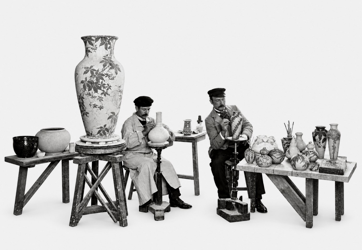
Svensk Form represents a version of design that now feels almost radical.
Sweden did not wait for an object to be finished before asking someone creative to make it desirable. Artists entered production early enough to change the object itself.
They worked inside porcelain factories, glassworks, textile mills and furniture companies. Some eventually became artistic directors, with influence over materials, techniques and what entered production. They did not merely communicate the value of industry. They helped decide what industry should make.
Artists to industry
This was not simply a government program, although the Swedish state later became an important participant.
The movement grew from Svenska Slöjdföreningen, the organization now called Svensk Form. Founded in 1845, it supported the drawing school that became Konstfack and worked to improve the quality of Swedish production.
In 1914, the organization formalized an unusually direct proposition:
The problem was industrialization. Mass production could make more objects for more people, but manufacturers were producing goods considered ugly, impractical and poorly adapted to modern life.
The proposed solution was not to retreat into craft. It was to place artistic experience inside the machine.
At Orrefors, the painters Simon Gate and Edward Hald began working directly with glassblowers and cutters. Their collaborations helped develop new approaches to engraving and established the glassworks internationally. Hald had trained as a painter. Inside the factory, painting became glass.
Beauty was a public question
In 1919, Gregor Paulsson published Vackrare vardagsvara: more beautiful everyday goods.
Paulsson argued that well-designed household objects should not be reserved for wealthy people. Industry could distribute quality at scale, but only if artistic judgment entered industrial production.
Design was therefore attached to a social project. A glass, chair or dinner service was part of the material environment in which ordinary life occurred. Improving those objects could improve life itself.
This was not uniquely Swedish. Britain had the Arts and Crafts movement and later founded the Council of Industrial Design. Germany’s Werkbund also connected artists, architects and manufacturers. Paulsson was directly influenced by German design reform.
Sweden’s distinction was not the idea itself, but the system built around it. Design education, manufacturers, exhibitions, museums, consumer organizations and eventually the welfare state reinforced one another. Design became industrial competitiveness, cultural education and social infrastructure at once.
No single institution produced this result. A network created the conditions for manufacturers to believe that artists belonged inside industry.
The problem with good taste
Vackrare vardagsvara assumed that trained cultural authorities could determine what constituted a better life. The 1917 exhibition was praised for addressing ordinary households, but it was also criticized for misunderstanding how working families actually lived. Airy rooms looked progressive in an exhibition. They were less useful to families who needed every room for sleeping.
Design for everyone can quickly become taste imposed on everyone.
The movement also produced a marketable idea of Swedishness: rational, restrained, functional and morally good. The history is messier than the objects suggest. Factories still depended on labor, sales and export markets. Artistic directors did not eliminate commercial interests. They negotiated with them.
But the tension is precisely what makes the model useful now. The system did not eliminate the conflict between design, commerce and social ambition. It gave that conflict somewhere productive to occur.
Design now enters late
Most contemporary companies value design. What differs is where they place it.
In one model, the business opportunity, technology and operational system are established first. Design makes the resulting product understandable, coherent and desirable.
In another, creative judgment participates earlier, while the product and the systems behind it are still being defined.
Neither model makes design inherently better or worse. They simply give it different responsibilities and produce different possibilities.
Artists to Industry belonged firmly to the second model. Gate and Hald could not have changed Orrefors by selecting a typeface for its packaging. Their importance came from sustained proximity to materials, tools, technicians and manufacturing decisions.
They were inside the factory long enough to alter what the factory knew how to make.
The factory has changed
The contemporary equivalent of sending artists into industry is not giving an illustrator a desk inside a warehouse. It is placing creative judgment alongside engineering, operations, research, policy and business decisions while the system is still taking shape.
This is different from adding “design thinking” to a workshop. The Swedish factories did not invite artists to contribute a creative perspective and then return to their studios. They created positions, workshops and careers inside production.
The lesson from Svensk Form is not that every company needs better taste or that designers should make every decision. It is that the timing and location of creative judgment determine what it can change.
The contemporary equivalent of Artists in Industry is not bringing design closer to business. It is giving design a role in shaping the business itself.
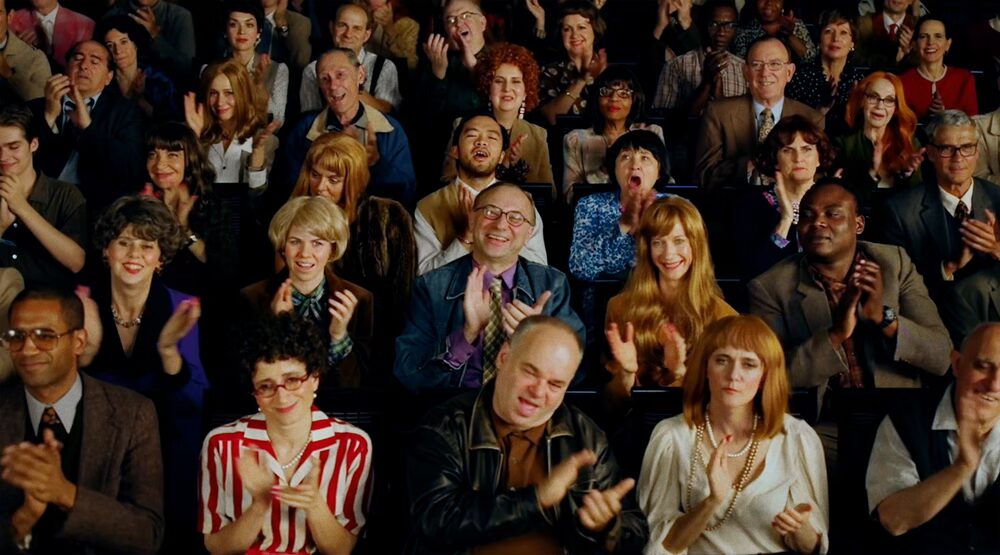
Early in my career, A/B testing creative felt almost illicit. Change the image, move the button, rewrite the sentence and watch human behavior change. Why did one version make someone stop while another disappeared? Why did one button get pressed?
It made creativity observable.
Advertising has measured its effects for more than a century. In the 1920s, Daniel Starch tested whether readers noticed and remembered print advertisements. George Gallup later studied which parts of newspapers people actually read, helping turn audience response into something companies could measure before committing large amounts of money.
The purpose was reasonable: give the people funding the work some confidence that it might succeed.
The average answer
Research is good at revealing confusion, preference and risk. It can show whether people understand an idea, remember the brand or know where to click.
It is less reliable at recognizing something they have never encountered before.
When responses are collected across a group and reduced to a score, the result naturally moves toward the middle. The strangest reactions disappear into the average. The work becomes clearer, easier to explain and more familiar.
It also begins to resemble everything else that tested well.
Architecture offers a physical version of the same problem. Many new buildings resemble one another not because architectural innovation has stopped, but because the systems surrounding construction reward what is already understood. Financing, insurance, liability, building codes and standardized materials all make familiar solutions easier to approve and repeat.
The unusual building is not necessarily less viable. It is simply more difficult to price, insure and explain. Innovation still exists. The system makes familiarity easier to build.
Research can have the same effect on creative work. It rarely prohibits the unusual idea outright. It simply makes the familiar one easier to approve.
This is particularly dangerous in branding and advertising, where the first requirement is often attention. A brand must be noticed before it can be understood, remembered or desired.
Research can tell us whether an advertisement feels acceptable. It cannot decide whether acceptance is the most useful outcome.
The missing creative
Research teams are built around methodology, behavioral science, strategy and analytics. These disciplines matter. But the people interpreting the findings are not always experienced in making unusual creative work.
A low score can mean that an idea is weak. It can also mean that the idea is new, unfinished, badly presented or difficult to evaluate in the artificial conditions of a test.
Someone has to distinguish a confusing idea from an unfamiliar one. Someone has to know which uncomfortable detail is the problem and which is the reason the work might be remembered.
Without that judgment, research does not remove subjectivity. It transfers creative authority to the people who designed the test.
Weird is a strategy
Japanese advertising can appear unusually strange to Western audiences: mascots, abrupt narrative shifts, exaggerated performances, dense graphics and celebrity cameos that seem to have escaped from another advertisement entirely.
When every surface is asking for attention, clarity is not enough. The work has to create a break in the environment. Weirdness becomes a way to produce that break.
As the surrounding field becomes stranger, an advertisement may have to go further to remain visible. What looks excessive in isolation can make perfect sense inside the noise it was designed to interrupt.
Inside a test, the unusual execution may appear confusing, polarizing or unnecessarily strange. In the market, those same qualities may be what prevent it from disappearing.
Research is designed to identify the risk of standing out. It is less equipped to measure the risk of blending in.
The creative dataset
Creative awards are easy to dismiss as an industry congratulating itself. Sometimes they are.
But awards may also be one of the only datasets built around creative judgment rather than consumer preference.
Research aggregates response. Awards aggregate the judgment of people who understand how difficult it is to make something unusual and get it into the world.
A jury of experienced filmmakers, designers, writers and creative directors can recognize what a conventional research panel may miss: which rule was broken, whether the risk mattered and if the work expanded what the industry believed was possible.
The winning work is rarely the average answer. It is the outlier.
Awards also create evidence inside companies. They show that the strange idea was not simply indulgent. It attracted attention, moved the industry or demonstrated a possibility competitors had missed.
That signal affects culture. Ambitious people look for places where ambitious work is recognized, protected and allowed to reach the public intact.
Awards are imperfect. Juries have biases. Categories reward trends. Prestige can become detached from effectiveness.
Conventional research has biases too. It rewards familiarity, clarity and whatever can be measured within the conditions of the test.
Put the jury before the launch
Awards recognize creative risk after it has been taken. The more interesting opportunity would be to move their model upstream.
Research companies already assemble panels of consumers. They could also assemble rotating juries of exceptional filmmakers, designers, writers, artists and creative directors.
The audience would measure comprehension, recall and response. The creative jury would evaluate originality, cultural potential and whether an initially uncomfortable idea deserved further development.
The two groups would answer different questions.
Does the work communicate?
Does it give anyone a reason to care?
This would not make research less rigorous. It would expand what the research is capable of seeing.
A low consumer score would no longer automatically mean that the work should become more familiar. It might reveal that the execution is weak, that the idea has arrived too early or that the audience is encountering something genuinely new.
Creative judgment would become part of the data rather than the opinion added after it.
Otherwise, the safest answer will keep winning - not because it is better, but because it is easier to measure.
Perhaps we should involve more people who understand creative risk in the evaluation process. Artists, filmmakers, designers, and people from outside the immediate industry. Not to replace consumer research, but to offer another perspective. People who can recognize the potential in something unfamiliar, rather than simply measuring how comfortably it fits into what already exists.
Every format has constraints. But within those constraints, the tool determines which possibilities are close at hand.
For most of my career, I began a project by opening an application. That choice appeared operational, but it was already creative. The software implied the process because the process had been designed by the company that made it.
Photoshop established a shared approach to digital images through layers, masks, selections and filters. InDesign organized publishing around pages, frames and styles. After Effects organized motion around compositions and timelines.
These are not laws. They are product decisions that became creative conventions.
Now I begin with a different question: What would I make if the software had not already decided how?
Why am I opening Photoshop?
Indie software and custom tools are not new. Artists, designers and studios have always modified instruments, written scripts and commissioned software.
I have started building tools around particular projects. Each does less, but it knows more about the specific project: its materials, constraints and intended behavior.
Instead of adapting the project to the software, the project commissions its own tool.
Gerhard Richter
Gerhard Richter’s abstract paintings were partly made with large squeegees built to move paint across the canvas.
The tool was not a more efficient paintbrush. Its scale and movement produced a different relationship between intention and chance. Layers were added, dragged, obscured and unexpectedly exposed. Richter could establish the conditions, but he could not completely determine the image.
The instrument changed what the work could become.
The project commissions its own tool
Choosing software was once an operational decision. Now, for more creatives, designing the tool itself can become part of the creative direction.
What should be possible? Which constraints might produce a better result? Does the project require twenty panels or three buttons?
This does not mean every creative should build everything. Existing software remains essential for collaboration, reliability and scale.
Some tools will become products. Others may exist for one studio or one afternoon.
Custom software is usually sold as efficiency. Its more interesting potential is invention.
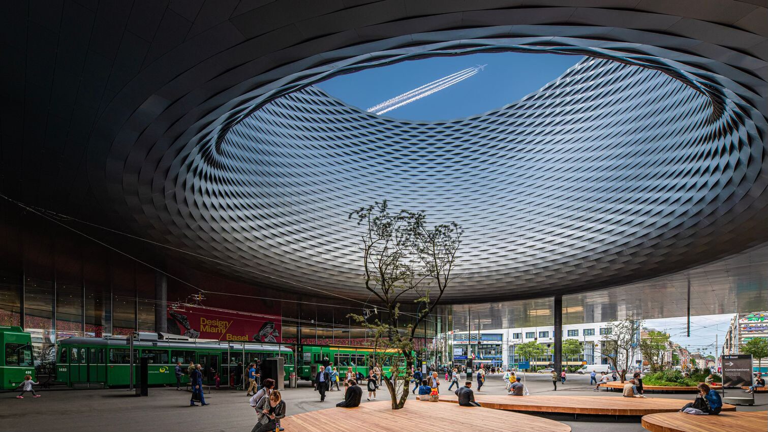
I traveled to Art Basel and Milano Design Week this year. Across both, the common thread was craft.
At Basel, the artist’s labor was often visible in the work. Fibers hung loose. Knots remained exposed. Materials looked accumulated, stressed, sorted or repaired. The object arrived with evidence of what had happened to it.
In Milano, brands expanded the same gesture into architecture. The workshop moved into the exhibition. Material libraries, prototypes, proprietary fabrics and demonstrations of technique occupied the foreground.
At Bottega Veneta, Kwangho Lee filled the Via Sant’Andrea store with leather cords woven alongside artisans from the house’s atelier. Stone Island presented one jacket in six dark-grey fabrics, then upholstered the furniture in those materials so visitors could sit on the difference.
The product was still there. But the process had become part of the product.
That made sense in the most literal way. Craft takes time. Time costs money. A difficult weave, a hand-finished surface or a material developed over years gives an object a history that can help explain its price.
This logic is especially familiar in luxury. The atelier becomes evidence that the object could not have appeared instantly.
But what I saw seemed to point toward something broader.
Much of the work in Milano was not handmade in opposition to industry. It came from brands with sophisticated factories, global supply chains and significant technical capacity. The attraction was not necessarily an escape from industrial production.
It was the opportunity to see production as a sequence of decisions.
A knot can do more than signal the hand. It shows where somebody chose to pull. A material library shows that alternatives were considered. A failed prototype proves that the finished object was not inevitable.
Proof of work
The phrase belongs to computing. Proof of work demonstrates that computational effort has been expended before a result is accepted. Here, it describes something less technical but increasingly important: visible evidence that human judgment occurred before the result appeared.
That evidence matters because results are becoming fast. The result may be impressive. It simply provides less evidence than it used to.
This may also explain why process is moving beyond galleries and exhibitions. Behind-the-scenes content is not new, but making is increasingly presented as the main event rather than supplementary material. Studio visits, material experiments, and “how it was made” films allow the audience to remain with the decisions instead of skipping directly to the reveal.
There is, of course, a risk of "Process theater".
The process shown by a brand is still a curated image. It can reveal experimentation, touch and transformation while editing out repetition, hierarchy, logistics and scale. The workshop can become scenography. Labor can become a texture applied to an otherwise ordinary product.
But that does not make every display of process false. A constructed presentation can still reveal something real: the intelligence inside a material, the years contained in a technique or the decision that changed the outcome.
The distinction is whether the process explains the work or merely makes the work look expensive.
Show the constraint that shaped the result. Preserve the version that failed. Name the person who solved the problem. Reveal the source, system or standard that made the final experience possible. Let people see where human judgment entered.
Process documentation does not have to remain backstage material released after the real work. It can establish authorship, create trust and distinguish one polished result from ten thousand others.
Craft may be everywhere because craft is still expensive. But it may also be everywhere because polish has become cheap.
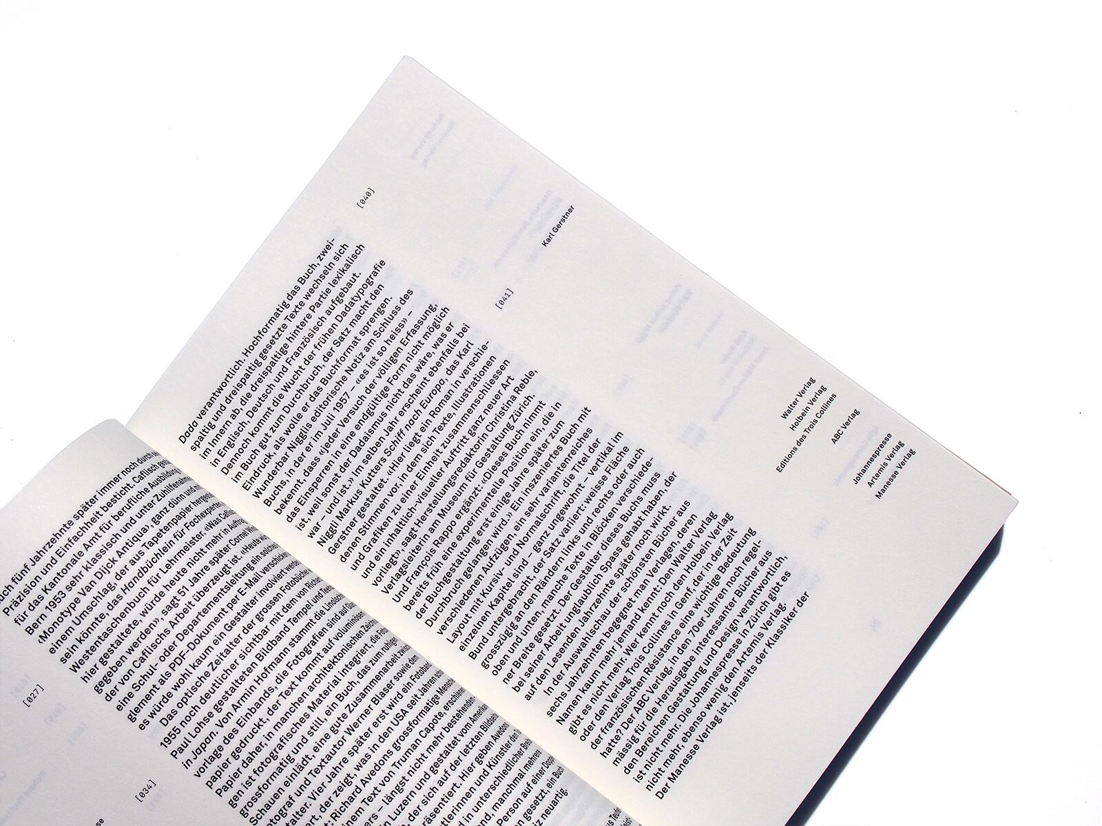
I fell in love with design through typography. But the part that continues to interest me most is typesetting: the set of decisions that determines how language occupies space and how it is read.
Typesetting was once a distinct stage of production, often handled by a specialist. Today it usually sits within design and is increasingly shaped by software, templates, and systems.
Typesetting has existed for centuries. Many of its conventions date back to the earliest printed books and have become so familiar that they feel inevitable.
I remember studying Julia Born’s typesetting. She broke one of the most basic conventions of reading: that every paragraph should return the eye to the left margin. Instead, she used the space left by the final line of one paragraph to determine where the next paragraph began. The text continued closer to where the previous thought had ended.
Breaking the rule created an unexpected decorative rhythm on the page, but it was not decoration for its own sake. It also made the movement from one paragraph to the next feel more direct and continuous. Born did not follow the inherited rule more elegantly. She recognized that the rule itself could be reconsidered. It was an extremely small gesture and, in typographic terms, about as punk as it gets. The beauty was not applied afterward. It emerged from breaking the rule for a reason.
Making language behave
In the 1920s, Bauhaus designers including Herbert Bayer rejected capital letters as part of an attempt to make written language more rational and universal. The distinction between uppercase and lowercase appeared unnecessary: two alphabets doing the work of one.
The Dutch artist herman de vries arrived at lowercase through a different logic. He writes his name without capitals and asks that the titles of his works appear that way too. For de vries, capital letters introduce hierarchy. Lowercase allows every word to occupy the same level.
Concrete poets worked with a related understanding. A poem did not exist only in the meaning of its words. Arrangement, spacing, scale, and repetition produced meaning too. The page was not a neutral container for language. It was part of the language.
Typesetting after the internet
Online, people typeset constantly without describing it that way. Capitalization, punctuation, spacing, and line breaks establish tone before the words have even been read.
Lowercase can make a message feel intimate, effortless, or slightly unedited. Conventional capitalization can feel professional, official or parental. ALL CAPS introduces urgency or excitement. Irregular MiXeD cAsE performs irony by making the language appear unstable or unserious.
These are typographic decisions, even when they are made inside interfaces that offer almost no control over typography.
The missing step
A company may spend years refining a logo and commissioning a typeface. The typeface arrives with an elaborate rationale about its proportions, personality, and history. Then the language is set in entirely conventional ways.
This is not necessarily bad. Default conventions are often clear, familiar, and optimized for reading. But when every brand follows the same conventions, much of the character promised by the identity disappears in use.
Typesetting is where a brand’s voice becomes visible. Line length, spacing, indentation, alignment, capitalization, punctuation, and rhythm can make language feel quiet or insistent, formal or intimate, restrained or expressive. These decisions can make information easier to follow while reinforcing the values and tone of the brand.
A logo identifies the brand. A typeface gives it a voice. Typesetting determines how that voice speaks. Leaving it to default is not a failure. It is a missed opportunity for storytelling.
Maybe the simplest place to start is the brief.
Make typesetting something to think about from the beginning. And challenge the people creating these identities to think beyond the logo and typeface.
How does it actually work? On a website, in an app, in a presentation, or even an email?
After all, an identity isn't just something to look at. It's something people have to use.